Grab your copy of the Right Click Save book!
News
April 29, 2026

The Art of Computers | Apple at 50

Founded in 1976, the $4 trillion company has created a hardware and software ecosystem for artists and designers
Dev Harlan, Untitled (The Dithering Series, Styrofoam Ethics Plus) (Detail), 2026. Courtesy of the artist
Now Reading:  
The Art of Computers | Apple at 50

On April 1, 1976, Steve Jobs and Steve Wozniak, aged 21 and 25 respectively, signed a partnership document with Ron Wayne, a former employee of Atari, to form the Apple Computer Company in Santa Clara, California. (Wayne left the partnership 11 days later.)

The 50th anniversary of the foundation of Apple is a reminder of the role the Silicon Valley-based hardware and software giant has played in shaping the visual aesthetics of the information age. In that time, computer-based editorial and design decisions have moved from the domain of tech-heavy corporate clients and into the handsets of artists, designers, publishers, and writers, together with new ways of working with color, light, images, and text. (A set of the original partnership documents were sold at Christie’s in January 2026 for $2.5 million.)

The global half-century celebrations staged recently by Apple have placed emphasis on the company’s association with music and entertainment — iTunes launched in 2001 and its industry-disrupting store in 2003.

A set of the original Apple company partnership documents were sold at Christie's in January 2026 for $2.5 million. Courtesy of Christie's
Before announcing his plans to step away from the company this coming September, Apple’s CEO, Tim Cook, wrote an open letter to Apple’s users, saluting them as “the crazy ones. The misfits. The rebels. The troublemakers. The round pegs in the square holes. The ones who see things differently.”

Cook’s message drew on the company’s two most famous marketing campaigns. First, the Ridley Scott-directed advert for the original Apple Macintosh, a riff on George Orwell’s satire on authoritarianism 1984 (first published in 1949), shown during the Super Bowl in January 1984 and framing Apple users as “the rest of us” rather than industrial overlords. Second, the “Think Different” campaign from 1997 that recruited the images of creative disruptors past and present, including the photographer Ansel Adams and the Ur-modern artist Pablo Picasso. 

This “outsider” rhetoric sits at odds with the financial facts of the past quarter-century. As the technology writer and historian of Apple David Pogue recently reported, nearly a third of the people on the planet — 2.5 billion — are carrying an Apple device at any given moment; the company ships 220 million iPhones a year; generates $1 million in revenue every 90 seconds; and has a market capitalization of just under $4 trillion.

Yet it is frequently overlooked that 2026 also marks the 30th anniversary of the return of Jobs — who oversaw both headline marketing campaigns — to a struggling Apple in 1996, as an adviser, 11 years after he had been forced out in a corporate power struggle. He became interim CEO in 1997. Jobs’s second, 14-year, stint in control of the company engineered its rise to become the most valuable in the world — buoyed by the success of the iPod (launched in 2001), iPhone (2007), and iPad (2010) — at the time of his death in 2011.

To mark these anniversaries, Right Click Save asked artists, curators, and gallerists to share their perspectives on how Apple continues to define the terms of the cultural economy. 

Whether it is through its innovations in personal and then mobile computing; user-friendly interfaces and software that have enticed the design and publishing industries; instantly recognisable hardware; and a level of brand dominance that has reshaped a generation of digital natives — and provoked campaigns to limit children’s access to mobile portals — Apple remains an unavoidable organ of contemporary capitalism.

The Apple Macintosh: The computer that said hello

The release of the Apple Macintosh in 1984 was a decisive moment in establishing the character of Apple products, creating an image of approachability to the untechnical, with its groundbreaking graphic user interface, that has carried through to this day. Where written commands had previously been the rule, users now wielded a mouse to click on icons, menus, and desktop windows to initiate actions. The welcoming character derived from the quality and charm of the pixel-based graphics and system fonts, including Chicago, devised by the artist Susan Kare.

Using graph paper, Kare formulated a series of classic graphics, including the floppy disk logo, to encourage users to load the disk needed to start work as well as the smiling computer symbol that indicates the disk is in place. 

Everything was created to ensure a high degree of legibility on low-resolution, monochrome screens, with Kare leaning into the power of skeuomorphs such as the Trash bin to introduce users to the new digital operating system.
The command symbol, based ultimately on the ground plan of a Swedish castle, was designed for Apple by Susan Kare. Photography by Right Click Save

In a 2025 interview with the Museum of Modern Art, New York (which holds one of Kare’s original sketchbooks) Kare recalls that her brief was to design symbols that would make the Macintosh a computer “for the rest” — for non-specialists. “A big part of that was using visual design to communicate,” she said. “Little pictures and symbols made that computer accessible […] Design did and can serve as a bridge, to be a great equaliser”. The classic Kare graphics on the Macintosh, and a crisp operating system devised by Andy Hertzfeld, gave computing a place that felt like “home” rather than a field of experiment for computing geeks.

Macintosh also featured the graphics tool MacPaint. When one of the Apple team demonstrated the app at the Macintosh launch presentation in Boston, first drawing and then erasing part of a textured circle, the audience clapped and whooped in disbelief. 

At that presentation Jobs had the Macintosh both write and say “Hello”, inviting the user to engage and, through Kare’s witty graphics, put a smile on the face of computing.

In 2024, Kare — whose distinguished career as a graphic artist has taken her to Pixar (with Jobs) and Pinterest — devised Esc Keys, a digital and physical collection in collaboration with Asprey Studio. It includes 32 pixel-based icons, which have been crafted by master silversmiths at the studio’s Atelier in Kent, England, as sterling silver computer keycaps or necklace pendants, with buyers receiving a related digital artwork inscribed on the blockchain.

Susan Kare, Heart icon for Esc Keys, 2024. Courtesy of the artist and Asprey Studio

The Macintosh gives comfort to artists 

In the decade between the launch of the Apple Macintosh and the rise of the internet in the mid-1990s, Apple’s desktop computers became increasingly identified with the design and publishing industries. “In the ’80s and ’90s, the Apple desktop computer was the go-to machine for creatives,” Steve Sacks, founder of bitforms gallery, New York, tells Right Click Save. “There was nothing out there that gave artists that comfort level. It had an aesthetic and appreciation for design. And I think that was really appealing to many artists.”

Those “classic” Macs maintained the company’s lead in graphic interface design in the face of competition from Windows-powered PCs, and with their beige bevel-edged monitors and keyboards, had a design chic that today engenders technostalgia. At a time now when many artists working in VR, photogrammetry, AI, and generative art, favor high-end PCs and graphics cards over Macs, it is easy to forget the Mac’s early superiority in graphics and color performance. 

Aldus PageMaker (the page-design forebear of Adobe InDesign) was released in 1985 for Mac only (with a version for Windows two years later). Also developed for Macs were the drawing tool Adobe Illustrator (1987), and breakout video-editing tools Media Composer by Avid (1989), and Adobe Premiere (1991). While Photoshop launched on Mac in 1990. The common feature of all these tools — from MacPaint in 1984 to Photoshop in 1990 — was that the user worked in WYSIWYG (What You See Is What You Get mode), thereby allowing artists and designers an advanced preview of their final products.

As the costs of both hardware and software remained beyond most domestic budgets until the early 2000s, Apple’s first desktop computers were mostly encountered in design offices and educational establishments. With its “competitive” price tag of $2,495, the original Apple Macintosh was indeed much cheaper than some of the room-filling alternatives that had gone before, especially for newspaper and magazine publishers, but still represented nearly 40 per cent of the price of a compact family car in the US. 

Apple’s successful appeal to the creative industries was so overwhelming that, by 1997, a “Think Different” campaign was imperative to countering the image of Apple as a “toymaker” for an elite arty constituency, just as the company was losing market share to more adaptable and scalable Windows hardware.

Technostalgia for Apple Macs of the early internet 

Today, the “Classic” period of Macs and PCs has become a subject of technostalgia for artists who feel a connection to the early internet age. In a 2023 essay for Right Click Save, “Notes on Retrofuturism”, the New York-based artist Dev Harlan discussed how he collected the beige box Compact Mac computers of the mid-to-late 1980s just as their obsolescence made them available in large numbers. 

“In one instance, a collector friend and I came across a large haul at a local recycling center, leading us to acquire nearly 300 Compact Mac computers,” Harlan writes. “Back then, 68K Macs had only just crossed into obsolescence — their worn beige and tan are the tones of optimistic pre-internet consumer marketing for a new ‘desktop publishing revolution’ or ‘information superhighway’.”

Dev Harlan, The Dithering Series, studio assemblage, 2026. Courtesy of the artist

In his recent series, “The Dithering” (2024), Harlan continues his exploration of the Mac Plus in what he describes to Right Click Save as “an easy shorthand for a uniquely ’80s techno-optimism that prevails to the present”. “I am also using [the series] to reflect, somewhat cynically, on the failures to adequately respond to climate science, which first became widely publicized in the same time period by the creation of the IPCC and the release of the first Climate Assessment report in 1990.”

“The title, ‘The Dithering’, has a double meaning. There is the familiar technical meaning given by the famous Atkinson dithering algorithm, originally developed by Apple, used to display beautiful images on the early 1-bit monochrome Mac. I borrow another meaning, coined by sci-fi author Kim Stanley Robinson in the novel 2312 (2012), which historicizes the early 21st century’s tragically inadequate response to the climate crisis as the ‘decades of dithering’.” 

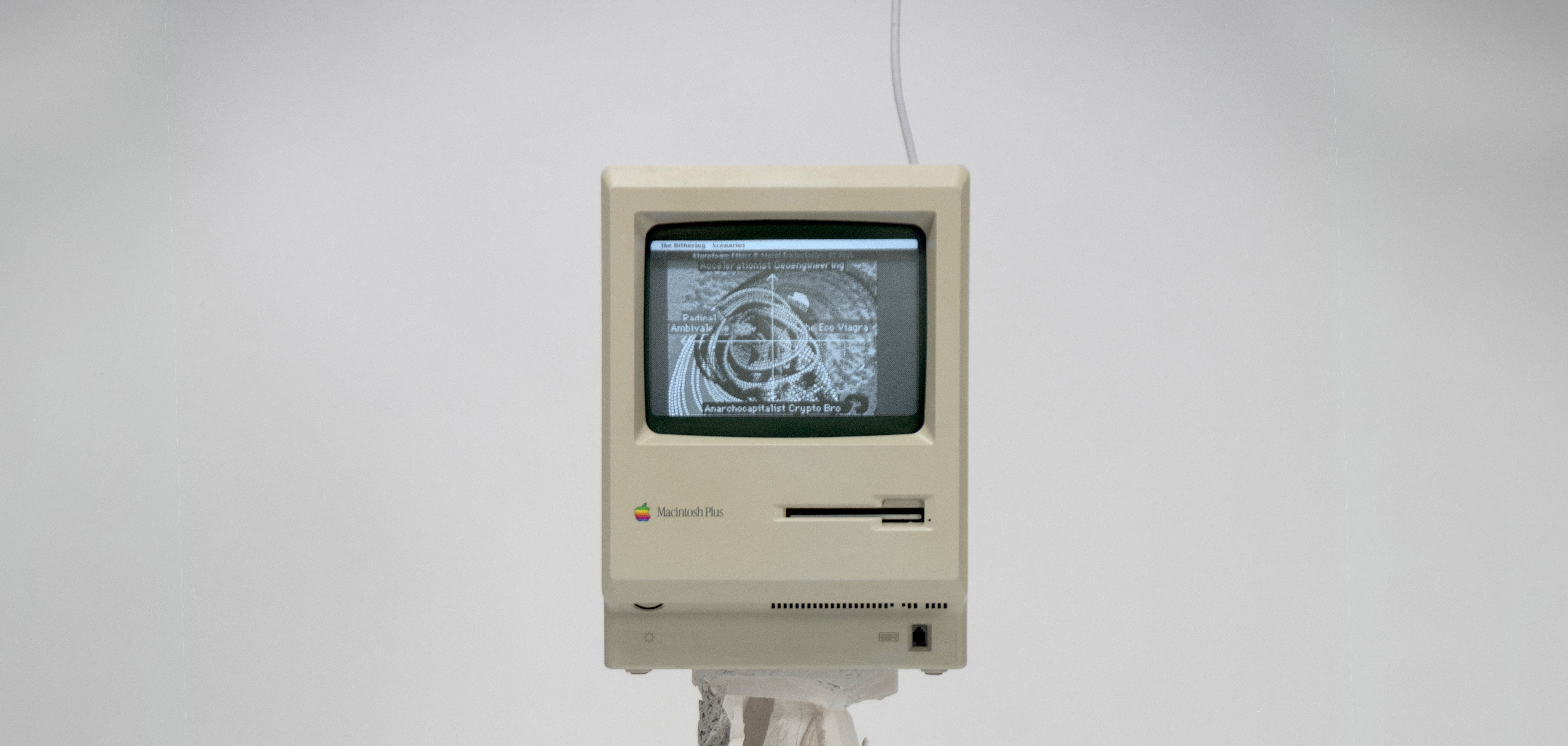
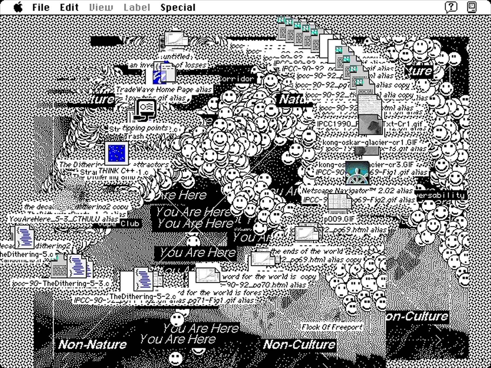
“I put the 1990 IPCC climate report on the desktop of a popular computer from the same time period to make it just that much more visceral how many years have been spent dithering on it.” (Dev Harlan)
Dev Harlan, The Dithering Series, Flock Of Freeport, 2024. Courtesy of the artist

In a similar vein, Jan Robert Leegte’s “Window” series (2022) is concerned with the aesthetics of “interface culture” and digital ornament, represented by variations on the desktop windows opened in 1997 on either Mac or Windows desktop computers.

“The mid grey chiseled computer interfaces of 1997 have always reminded me of sculptures created in bas-relief,” Leegte writes on his website, “a technique going back to the stone carved petroglyphs that is as ancient as humankind’s first steps in making art."

"The combination of illusion and tactility found in these interfaces shows our longing to have the computer experience to be part of the material world.” (Jan Robert Leegte)

The series was featured by Right Click Save in Florence Wildblood’s essay 2023 essay “Who Owns the News in Web3?”, and was a prime inspiration — along with the Atkinson dithering algorithm — for the front page aesthetic of the magazine’s downloadable quarterly digest, Art & Tech.

The front-page design of Right Click Save's Art & Tech quarterly digest was inspired by Jan Robert Leegte's series Window (2022) and to the Atkinson dithering algorithm devised by Apple

Associations with high-profile artists

The lore of the desktop computing revolution of the 1980s contains heady stories of hardware manufacturers looking to associate their computers with the creative cool of high-profile artists. Both Andy Warhol and Keith Haring made work with the Commodore Amiga, launched a year after the Apple Macintosh at half the price, and with full color screen. While the Quantel Paintbox recruited a raft of leading artists, including Haring (who felt it “totally revolutionized the notion of art and the image”), Richard Hamilton, David Hockney, Howard Hodgkin, and Sidney Nolan — to experiment with its high-end graphics capability for a 1987 BBC documentary series, Painting with Light

As the arch marketer, Jobs knew the value of channeling artists’ cool to the Apple brand. On October 9, 1984 he received a last-minute invitation from a journalist who was profiling him to the ninth birthday party in New York of Sean Lennon, son of Yoko Ono and the late John Lennon. Jobs brought an Apple Macintosh along as a present for the young Lennon. The party was also attended by three artists: Haring, Kenny Scharf, and Warhol. On that occasion, from what we can tell from photographs taken of the scene, Haring drew a compellingly outlined figure and Warhol a slightly minimal circle. 

A man had been calling him repeatedly, asking him to try out a new computer, Warhol reportedly told Jobs at the party. “Yes”, Jobs replied, “it was me.”

When, in February 2024, Apple finally entered the world of augmented reality and virtual reality with the super high-end, high-resolution Apple Vision Pro, ten years after the sale of Oculus Rift to Facebook (now Meta), it did so after running a development plan involving one of today’s leading media artists, Refik Anadol, and the team at Vortic XR, the industry-standard VR platform for art galleries and museums.

Installation view of Maya Man, “StarPower”, at bitforms gallery, New York. Courtesy of the artist and bitforms. Photography by Max C Lee

Apple as Archetype

From 1984 to the present day, Apple hardware has, through brand storytelling and the volume of its adoption, become a visual reference point, indeed an archetype, for a desktop computer, keyboard, tablet, or smartphone.

That style “presence” has caused Apple products to be collected by design museums such as MoMA, the Computer History Museum in Mountain View, California, and the V&A, London. The recognisable Apple iconography has served for artists as a visual metaphor or symbol of technology-facing culture in artists’ work. It is a symbolic language codified, and easily recognised, by the rigorous “house look” created for Jobs by Jonny Ive, from the multicolored iMac in 1998, to the iPhone, with transitions from white to silver to black, and a powerful association with sculpted aluminium and rounded corners.

In a recent interview with Right Click Save, the artist Maya Man spoke of her reasons for using wall-mounted iPhones to host the short StarQuest Edit clips now on show as part of her exhibition “StarPower” at bitforms, New York.

Maya Man, StarQuest Edit #2 (girl like me), 2026. Maya Man, “StarPower”, at bitforms gallery, New York. Courtesy of the artist and bitforms. Photography by Max C Lee 

“They are mounted on the wall in a way that influencers often use to film themselves,” Man told Right Click Save. “Presenting the piece with the phone in [the exhibition] context makes the phone into a sculptural object.”

Man, who was born in 1996, says that from a young age, her relationship to the internet “was not only something that I had access to on the computer, but also [...] on the phone. And I think my perception of being online is very tied to the idea of the phone. And it’s very fluid […] where you can move seamlessly between phone and computer and access the same universe, but [not] tied to one specific device.”

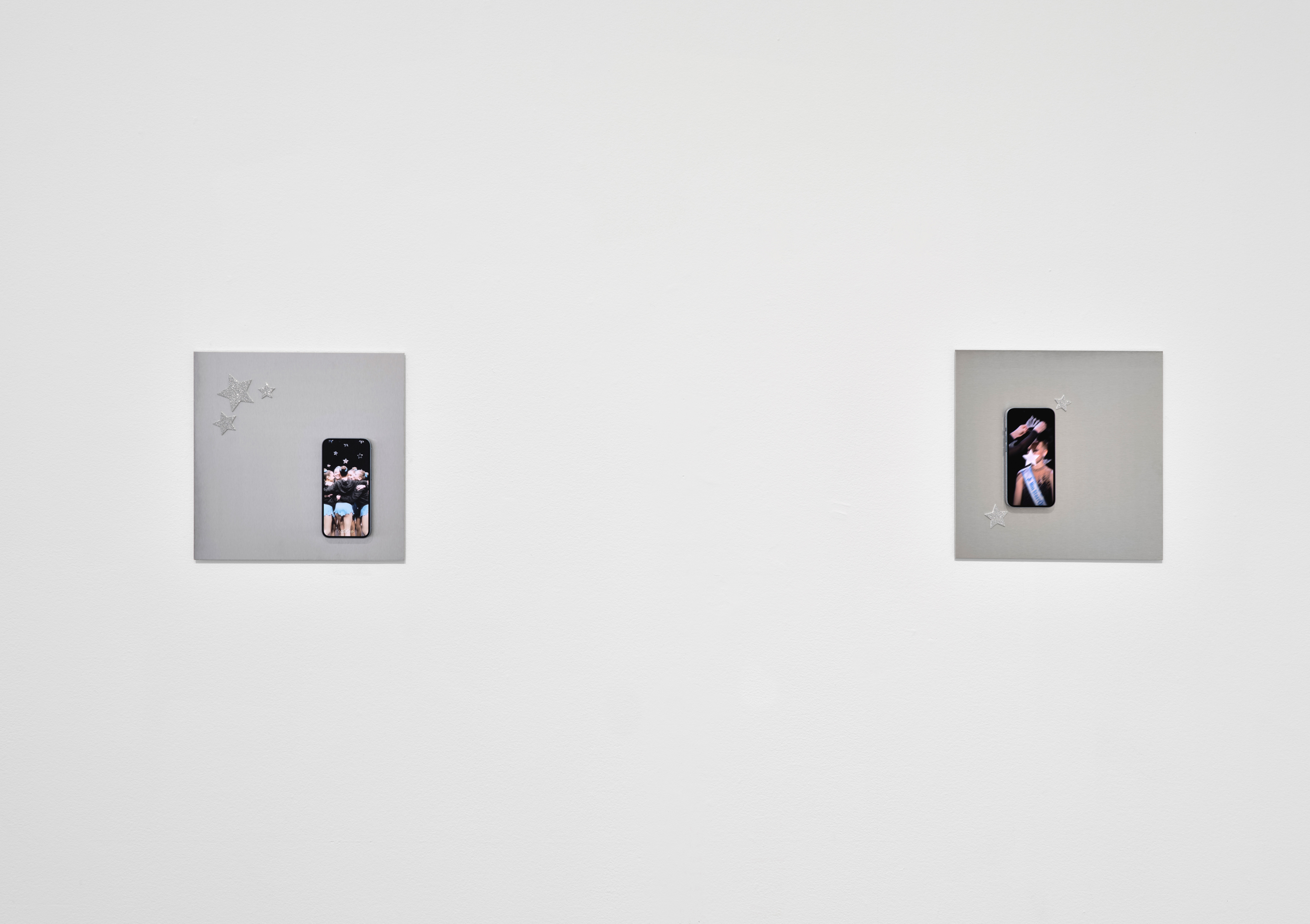
Having iPhones on the wall, Man tells Right Click Save, asks people “to really look at what’s on the phone, but also look at the phone itself, how small it is, but how powerful it is in our lives.”
Viktoria Binschtok, digital semiotics (weed), 2024. Courtesy of the artist and Nina Roehrs

Another artist, Sarah Friend, presents her work Lifeforms (2021) using iPhones. She did so, she tells Right Click Save, because “in some way I feel the iPhone (especially this era, which was the iPhone 6) is somehow the Ur-phone, from an aesthetic sense.” 

“But I actually don’t use Apple devices personally. In fact I make a point not to. There’s quite a bit I don’t like about the company and its software ecosystem. I would much rather use a phone where I can side load apps, easily root the device, or install my own operating system. Not to mention [have] a wide array of choices regarding hardware and device manufacturer that comes with no lock-in.” (Sarah Friend)

Other artists, including Viktoria Binschtok, and Tom Galle, have used the Apple keyboard, a peripheral interface that has had a long aesthetic journey of its own, as a metaphor for art’s engagement with technology.

Dev Harlan, Untitled (The Dithering #66), 2024. Courtesy of the artist

In Apple’s walled garden

In the smartphone era, Apple has reinforced its historic “walled garden” approach, which limits device interoperability to safeguard performance and security — a source of frustration to those artists wishing to sideload content and control their computers’ capabilities.

Apple’s approach reflects the company’s careful and long-standing control over its brand, which translates to homogenous performance across Apple’s iOS operating systems.

The iPhone has also led the way, alongside Android alternatives such as Google Pixel, in integrating algorithmic adjustment, or “facetuning”, into the act of taking a photo with new generation smart phones. Gretchen Andrew’s Facetune Portraits (2025), two of which were recently acquired by The Whitney Museum of American Art, uses robotics to paint popular “beautifying” AI-driven filters into oil paintings, revealing “the tension between who we are and who AI and algorithms say we should be”. 

Gretchen Andrew, Facetune Portrait—Universal Beauty, Puerto Rico (2025, left) and Facetune Portrait—Universal Beauty, USA (2025). Photography by Luis Ruiz, Heft Gallery. Courtesy of the artist and Whitney Museum of American Art

“My Facetune Portraits,” she told Right Click Save in 2025, “show how diverse faces and bodies are compressed into a single form. There is a democratization in these tools, in that anyone can use them and they don’t require special skills, yet they are flooding our media and setting expectations in really damaging ways.”

“I still have my Google Pixel 3, as it was made before Google and Apple started to mess with the algorithms in the camera that change our faces and bodies.” (Gretchen Andrew)

Andrew adds, “[w]e have reached a point where the camera is no longer trying to show us what the lens sees; it is trying to show us a version of ourselves that aligns with the curated, polished expectations of a digital-first culture. It is less about optical fidelity and more about an algorithmic consensus of beauty.”

“David Hockney: A Year in Normandie and Some Other Thoughts about Painting”, installation view, Serpentine North, 2026 © David Hockney. Photography by Right Click Save

The pragmatic ambition of David Hockney

In the absence of Andy Warhol, who died in 1987, and, in particular, Keith Haring (1958-1990), David Hockney stands out as a globally recognized artist who has absorbed a pragmatic, iterative approach to involving technology in his working praxis. 

Hockney’s presence at the first demonstration of Adobe Photoshop in 1990, and subsequent purchase of an Apple Macintosh II, afforded him new ways of working with images taken with a Canon video-and-still camera. At that time he saw the computer as a means of making art inside a “printing machine”. In his book That’s The Way I See It (1993), Hockney published an image, Untitled (1991), made on his Apple Mac II FX computer using Oasis software.

The sense of discovery is palpable. “What really excites me about such a process,” Hockney writes, “is that none of the conventional intervening processes of reproduction have been used: this very picture is an ‘original’. Before this book was printed you could only look at this image on a computer screen and what you are looking at now is a 99.9 percent accurate reproduction of my ‘drawing’ on the screen.” 
“David Hockney: A Year in Normandie and Some Other Thoughts about Painting”. Detail. Serpentine North, 2026 © David Hockney. Photography by Right Click Save

The advent of the iPhone (2007) and iPad (2010), coupled with the Brushes app, which allows sketching with brushes and pencils through the touchscreen, afforded Hockney a new capacity to work with light and color without the tyranny of drying times. In his early iPhone days, he would send a group of friends a daily drawing of the view from his bed at home in Yorkshire. The quality of his iPad drawings has grown over time, through application and experiment.

The iPad as a medium came into its own for Hockney during the COVID-19 pandemic lockdown of 2020-21, which he spent in France at his studio home at Beuvron-en-Auge. The outcome was A Year in Normandie (2020-21), a 70-metre-long frieze printed on paper comprising some 100 “plein air” iPad drawings. The latest iteration of the work is on show at Serpentine North, London. 

Speaking to the exhibition’s curator, Hans Ulrich Obrist, Hockney reinforced Apple’s long-term impact on his practice: “You know, ultimately, I can just sit outside with the iPad and paint the moon’.” 

🎴🎴🎴

Louis Jebb is Managing Editor at Right Click Save.